Creating Conditions to Embrace Change: Rebranding Kiser Group
Amidst the tumult of rising interest rates, supply chain disruptions, and geopolitical tensions, the mid-market multifamily market has weathered the storm, offering property owners and investors stable occupancy rates, rent growth, and impressive returns. This resilience is mirrored in the journey of Kiser Group, a leader in the multifamily mid-market space, particularly within Chicago and its environs. Their decision to embark on a rebranding initiative was not merely cosmetic but a strategic move to align with market shifts and the needs of their clients.
As Otherwise began the collaborative work of rebranding, we focused our strategy on a clear acknowledgment of the multifamily mid-market’s enduring strength and the pivotal role it plays in the real estate economy. We infused the work with Kiser Group’s desire to secure recognition in a unique context that exists beyond the reach of large, national brokerages, giving them the ability to attract and nurture talent at all career stages. Armed with fresh, resonant insights, we were able to articulate a vision aimed at sustaining Kiser Group’s leadership in the multifamily space while expanding its horizons to new market sectors and regions across the country.
Reflective Messaging
As with all of our brand-building initiatives at Otherwise, the Kiser Group journey was grounded in a meticulously crafted messaging that articulates the company’s emergent culture and purpose. It positions Kiser Group as a trusted guide for multifamily owners and investors, leveraging deep market experience and commitment to client success. This rich narrative is not just a marketing tool but a manifesto that aligns the brand’s strategic ambitions with its operational ethos, setting a stage for meaningful engagement with all stakeholders.
Resonant Tagline
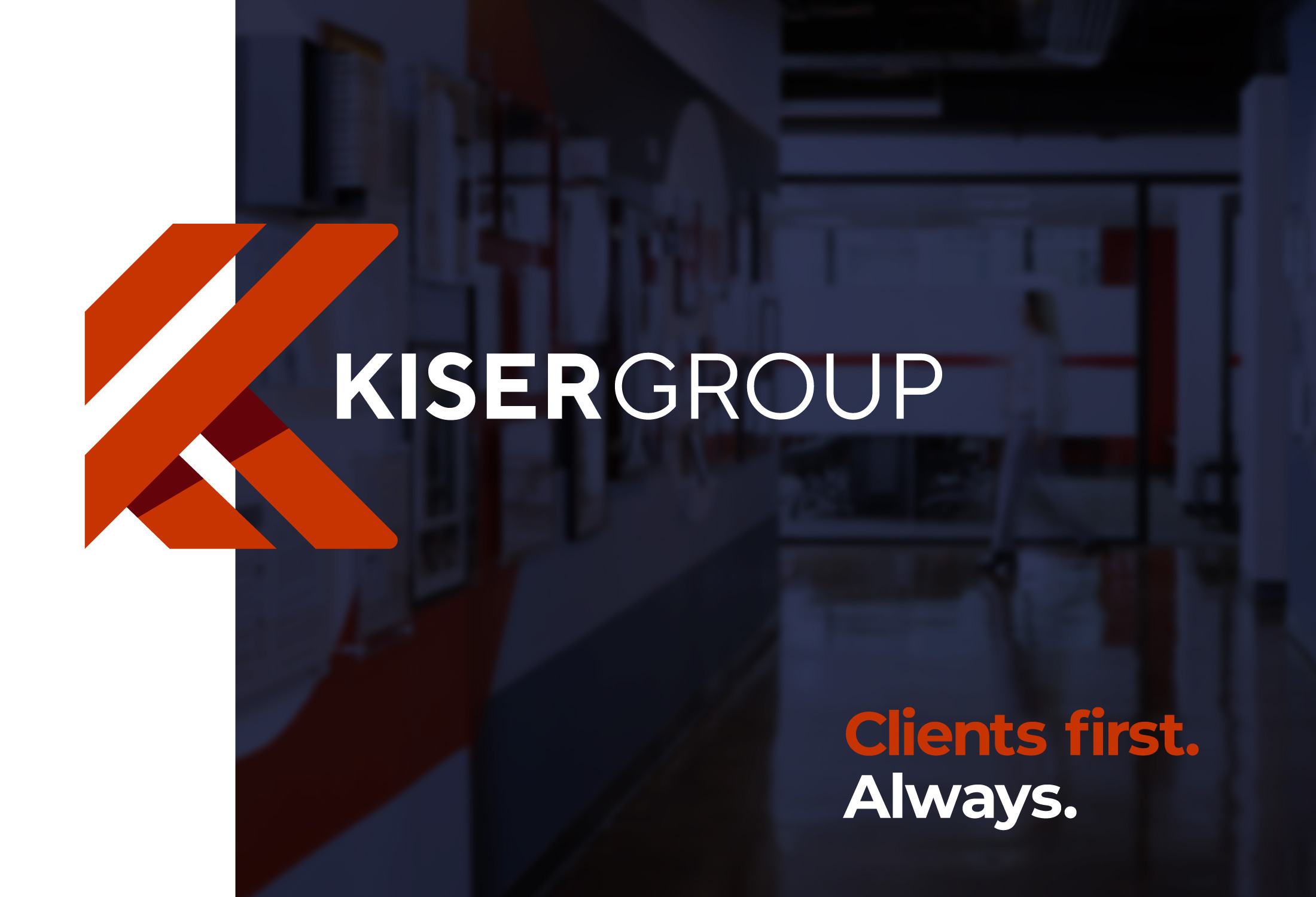
The tagline is an integral element of the Kiser Group brand. It functions as an expression of its unique character and promise, while using the power of language to express tone, sensability, and personality. The tagline, when used in conjunction with the visual identity, serves as a thematic platform that lends consistency to all marketing initiatives.
The tagline, CLIENTS FIRST. ALWAYS. Comes from the heart of the Kiser Group brand messaging. It reflects the deeply-held belief that Kiser Group only experiences success when their clients succeed. Armed with this mindset, they do whatever it takes to bring about positive outcomes on clients’ behalf.
Fresh Visual Identity
In a world cluttered with information and fleeting attention spans, Kiser Group’s new visual identity aims to cut through the noise. It reflects a commitment to innovation, professionalism, and resonance with audiences that are both internal and external, serving as a powerful tool kit to drive continued success over the long haul.
In the reimagining of Kiser Group’s brand identity, Otherwise gave fanatical attention to its visual representation, embodying the firm’s ethos and strategic direction with a distinctive brand icon and logotype. The visual identity is a nuanced blend of stability and dynamism, capturing the essence of Kiser Group’s interconnectedness, growth, and potential. The brand icon, with its angular design, evokes images of buildings and neighborhoods, suggesting harmony, energy, and endless possibilities. This icon, paired with the elegant and timeless logotype placed within the angles of the mark, offers a visual narrative of Kiser Group’s commitment to creating and nurturing community connections and navigating the complexities of the multifamily mid-market.
The choice of Gotham for the logotype reflects a balance between the familiar and the undiscovered, mirroring Kiser Group’s approach to being both grounded and forward-thinking. This typeface, known for its intuitive appeal and versatility, aligns with the brand’s vision of demonstrating a keen understanding of complex systems while maintaining a sense of practical wisdom.
Engaging Website
The centerpiece of the rebranding is the new Kiser Group website. With its fresh, contemporary, and inviting user interface, the site amplifies the company’s core conviction of navigating clients through complexities and opportunities in the multifamily mid-market. In our design and programming, Otherwise used bold color, beautiful original photography, and distinctive graphics to draw in visitors and give them endless options to explore, learn, and take action.
The rebranding of Kiser Group represents a thoughtful response to the evolving dynamics of the multifamily mid-market and the broader economic landscape. By bringing new vitality to the company’s enduring vision, Kiser Group is poised to reinforce its market leadership, attract and retain top talent, and venture into new markets with confidence.