Google and the Aesthetics of Function

On September 1st Google introduced a redesigned logotype. And what a ruckus it has caused…
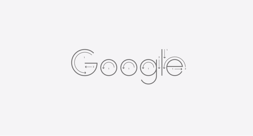
The redesign involves three essential changes. First, Google changed the font used in its logotype from a serif to a new sans-serif typeface they call Product Sans. Second, Google introduced colorful ‘dots’ that function like the Windows hourglass or Mac’s ‘spinning wheel of death’ to indicate that “Google is working for you.” And finally, Google reverted back to using the upper case ‘G’ as their favicon containing the brand’s signature palette of four colors.

The commentary on the visual identity changes has been immediate and widespread. Sarah Larson from The New Yorker wrote that while the original serif typeface had a “reassuring hint of history,” the new look “evokes children’s refrigerator magnets.” The BBC on the other hand quoted graphic designer David Airey who welcomes the change, and reasons that the serif typeface never truly fit the image of such a young company anyway.
But whether you like Google’s new look or not, many of the commenters seem to be missing the point. Google’s looks have been constantly changing from the company’s inception, and this time they have focused on improving the design’s performance and increasing accessibility. Google boasts that the newest logo is only 305 bytes (about 1/5 the size of the previous version), making it easier to load on devices with low bandwidth connection. While Google stresses legibility, they also downplay the importance of aesthetic appeal, explaining that the new identity was designed in a geometric grid system, making it “pixel perfect everywhere it’s used.”

It is curious that amidst all the noisy reactions, few opinions take into account Google’s clearly articulated intentions: accessibility, legibility and performance. Google says, for instance, that by drawing inspiration from the “childlike simplicity of schoolbook letter printing” they were able to retain the accessibility and legibility of their original typeface in the new Product Sans.
Visual Communication Design professor Jorge Frascara wrote in his 1988 essay “Graphic Design: Fine Art or Social Science?” that “Graphic design is the activity that organizes visual communication in society.” He believes that the quality of graphic design is meant to be evaluated not solely based on its aesthetics, but on the “change that it produces in the audience.” In other words, a design’s ‘performance’ should be as important as its aesthetic value. Spurred by political ideologies, similar philosophies prevailed in the first half of the twentieth century. The Constructivist and Bauhaus eras were marked by a focus on art’s practicality in society. The style of design in both these artistic movements was characterized by simplicity and geometric purity. Paul Renner’s Futura typeface, designed in 1927, bears resemblance to Google’s Product Sans with its clean geometric shapes and round O’s, suggesting that the idea of practicality delivers the same results: a crisp, clean, legible design.
There is much more to Google’s latest design than the question of where one stands on the spectrum of loving or hating it. You don’t have to sympathize with giant corporations at all, and you don’t have to like Google’s latest logo for that matter. The important thing is that the evaluation of a piece of graphic design should start with an understanding of design’s possible roles and purposes, and hopefully with an appreciation for the rich and wonderful history of typography.