Pantone Chooses Connection and Intimacy in 2019
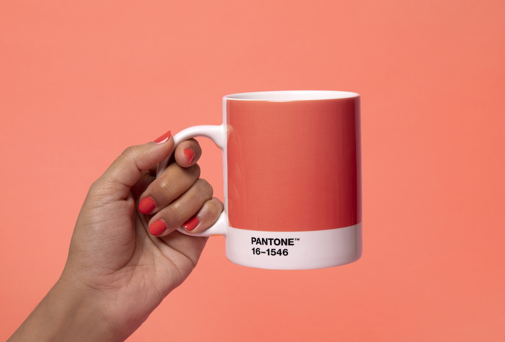
Just last week, Pantone announced that its Color of The Year for 2019 is Living Coral, which, as it names suggests, emulates the warm and radiant colors found within the underwater ecosystem of coral reefs. Colors like Living Coral that occur within nature, often serve a larger biological purpose while being sought after for their aesthetic value; a value that is undoubtedly conditioned by culture.
Since 2000, the Pantone Color Institute has been conducting research into the ever-evolving landscape of color, culminating each year with an announcement for Color of the Year. While it is seen as a forecast of trends, it is actually indicative of ongoing trends from the year it is announced.
According to their official site, Pantone’s selection comes as a reaction to the growing influence of social media and digital technology in everyday life, writing, “…we are seeking authentic and immersive experiences that enable connection and intimacy.” The color pops and calls for attention, which in social media is the touchstone for great content. It is exactly for this reason that our team at Otherwise has used Living Coral in some of the brands and campaigns we’ve created over the years. Ahead of the curve?

Take, for example, the campaign Otherwise executed for 3Eleven, a high rise luxury apartment project in the heart of River North, in 2017-8. The illustration, created by Helsinki-based artist Janine Rewell, features playful and dynamic vector imaging that is activated with the warmth and whimsy Living Coral provides.

Otherwise’s approach to design and color is always holistic, as the 2015 campaign for Ranquist Development Group’s Basecamp SFH project in Old Irving Park demonstrates. We built a campaign around our playful logo design, which takes the shape of the proposed site plan. We also activated the rough-and-tumble project site, with its distressed walls, with hand painting that included a sophisticatedly fresh palette that included…Living Coral.
So while the design world waits with baited breath for Pantone’s annual announcements of trending color, you might just check back with Otherwise to see what we’ve already discovered!