The Forge Case Study
How can we harness the allure of natural beauty and the complexity of personal challenge to craft a brand for a truly novel outdoor experience?
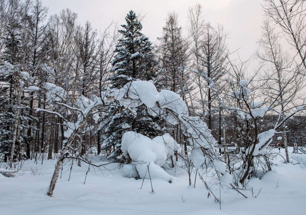
Jeremie Bacon, Chris Gladwin and Bartly Loethen have concepted something unique to the US market—an outdoor experience that both celebrates natural beauty and provides endless opportunities for personal challenge in a curated outdoor environment. Inspired by the popular European event adventure racing, the three innovators sought a partner to bring this brand to life. With Otherwise’s unique expertise in real estate branding and working with early stage companies, we were the ideal match for this opportunity.

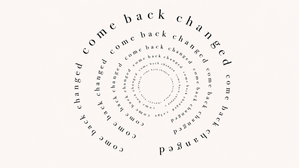
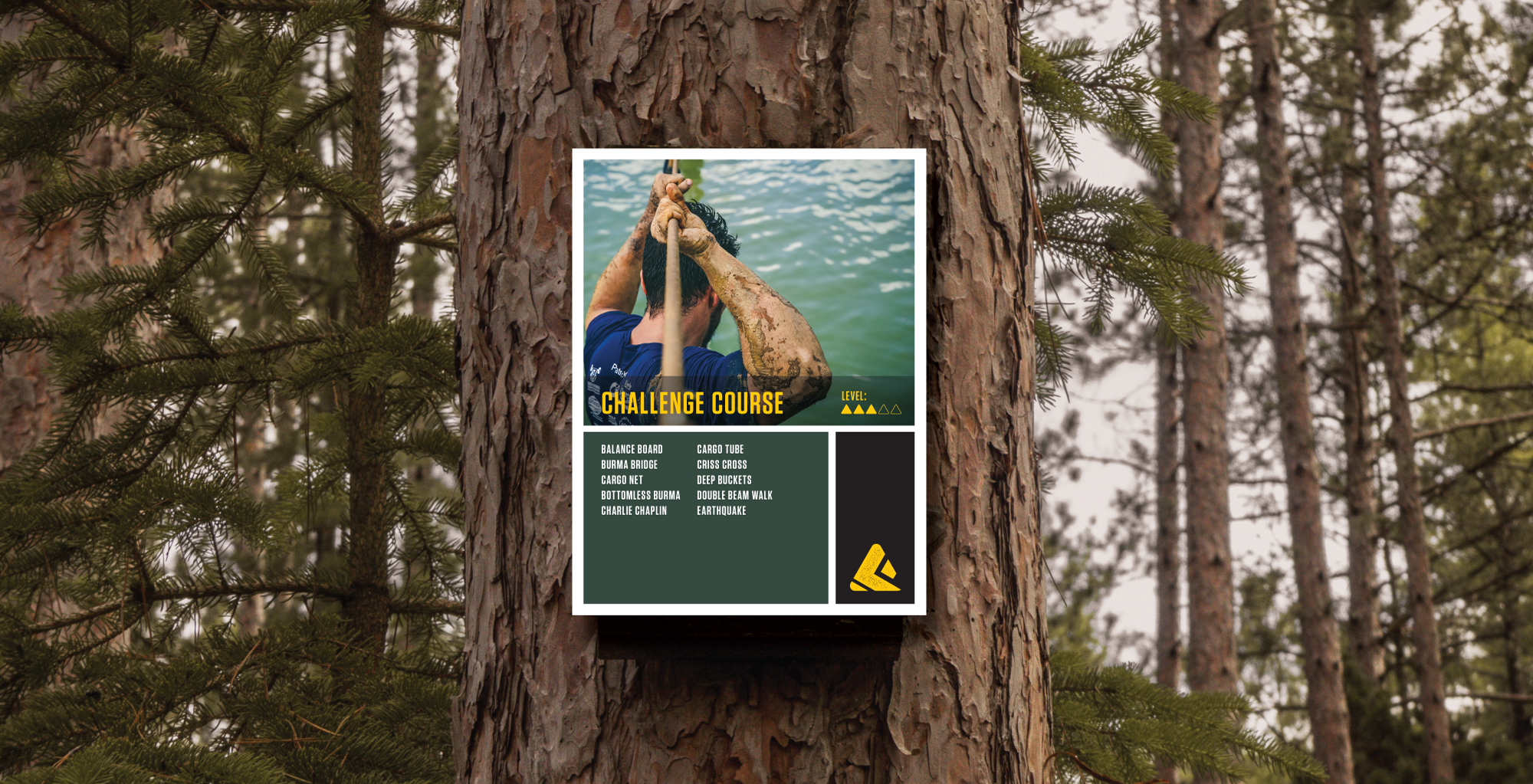
The project began with discovering the brand’s core principles and beliefs, laying the groundwork for the messaging and visual assets that would follow. We found this innovative concept combined the thrill of adventure racing, a love and commitment to natural beauty and preservation, and an unyielding respect that the definition of physical challenge is highly personal. The brand had to appeal to a diverse audience, ranging from families with young children looking for a weekend away to competitive athletes seeking their next big test. The name, The Forge, arose as a testament to a space that helps us develop, or forge, new challenges for ourselves in a community of like-minded outdoor enthusiasts.
The visual identity followed. The logo suggests a tread mark of a boot “forging” forward as well as a mountain waiting to be tackled. The color palette includes hues of natural blue, green and brown, celebrating the outdoor world. These crucial assets are the foundation of a brand that inspires to expand nationally. Keeping this in mind, all assets were fine-tuned for editing and further development as the brand grows.