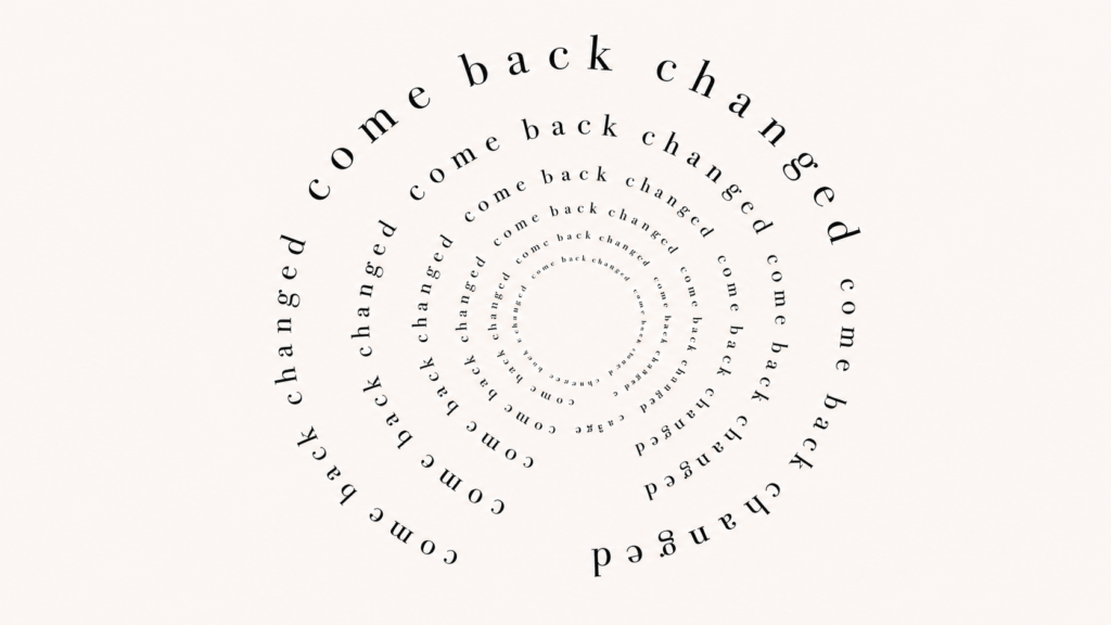
Helvetica Now: The Importance of Type Evolution

Of all the elements of design, typography is unarguably one of the most important; a carefully-chosen, well-tailored typeface sets fantastic design apart from the mundane or mediocre. Amidst a handful of iconic typefaces, Helvetica stands in a league of its own. Originally designed in 1957 by Max Miedinger in Switzerland, “Neue Haas Grotesk” made its debut as the newest sans serif in the Swiss market. A few years later, its name changed to Helvetica, a more internationally-marketable title. It wasn’t long before it developed into the standard for advertising and corporate branding in the United States, eventually becoming the default sans serif for Macintosh in 1984. From then on, Helvetica’s notoriety has only expanded.
Since its origins, Helvetica has evolved into one of the world’s most widely-used type families, even inspiring a full-length documentary about its impact on culture. Just last week, the globally- recognized font got a facelift for the first time in 36 years. Helvetica Now, an iteration of this ubiquitous font, introduces new facets of Helvetica’s classic form.
So why does such a popular font need an update? As prominent as Helvetica is, the typeface is polarizing — designers either love it or hate it. Regardless of personal opinions, it has been used by countless iconic brands, including American Airlines, Panasonic, Toyota, Google, Apple, IBM and Netflix. It’s all over the New York City subway system signage. So between oversaturation and adapting type for the digital age, Helvetica was due for a new chapter.
Helvetica Now is designed for translation across digital and print platforms, a flexibility that was previously challenging. The updates include Helvetica Now Micro, designed for small screens, Helvetica Now Display, created with even kerning for larger applications, and Helvetica Now Text, made to maintain legibility in visually crowded environments.
As design disciplines grow and evolve in tandem with technology, there’s an expectation and demand for typefaces to progress, as well. As designer Danny van den Dungen quoted to The New York Times in 2007, “when something is constructed as well as Helvetica, it should last for a couple of hundred years, just like great architecture.” While fonts like Helvetica — or great architectural masterpieces — are built to withstand the test of time, regular maintenance and reevaluation ensure that they remain functional for years to come.
Looking back on Helvetica’s extensive history, it’s clear that good typography has serious impact. Type, whether drawn, designed or chosen, is crucial to the proper execution and messaging of a brand. Even in its original form, Helvetica exemplifies the lasting legacy of fantastic design, the influence of beautiful typography and the need for adaptability.
At Otherwise, our passion for typography merges with our expertise in strategy, content and design to create inventive marketing solutions. Attention to detail and intentional strategy is at the heart of our work, affecting each type choice we make. Looking towards the future, we’re eager and excited to see Helvetica Now implemented as an expression of our clients’ brands.