Introducing Distance Sans, A Virus-Inspired Typeface

Facing COVID-19, we’re craving connectedness now more than ever. While we know that social distancing is a forward-thinking and essential response to flatten the curve, its inevitable effect is fewer face-to-face interactions. Being social is inherently human, and without that ubiquitous experience of humanity, we’re grieving a collective loss. So while we combat COVID-19 through social distancing, we’re combating loneliness, too — by becoming more adaptable and more flexible to overcome this new obstacle.
No longer during the work day can we walk over to a coworker’s desk to strike up a conversation or collaborate in the moment, but we can hop on Friday Zoom calls to share our weekly successes and the things we’re looking forward to most over the weekend (hello, candle making with a partner on a Saturday morning). No longer are our personal lives saturated with impromptu trips to the bar across the street for a beer (we miss you, EZ Inn), but we can kick start a new video chat book club or reinvigorate our yoga practice with virtual classes. People, globally, are craving togetherness and are making it happen through creative and inspiring ways.
What all these responses have in common is that we’re working together, thinking together and finding new ways to be together even when we’re apart. It’s happening everywhere, from individual offices, to community neighborhoods, to professional fields, where people with different backgrounds and skills have been discovering how to connect with one another through their craft. Graphic designers may not be changing the world single-handedly, but we can use typography to relay knowledge, language and ideas — and to inspire and inform.
That’s where type comes in. From Helvetica to Bodoni to Frutiger, typography has always been a powerful tool used to communicate ideas, showcase brands and even transform cities. The best typography — fonts that survive the test of time — have distinct visual personality and enhance the meaning of the text, with the ability to convey a mood or feeling beyond language itself.
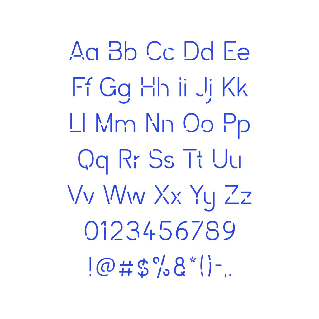
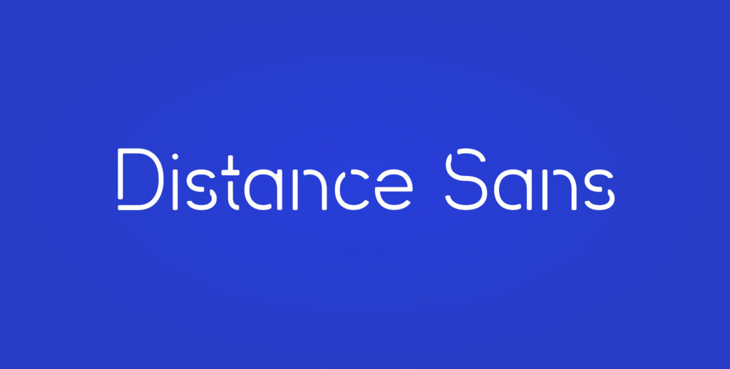
At Otherwise, our graphic design team was inspired to create a typeface that mimics social distancing. Our Distance Sans font creates balance between positive and negative space in an unconventional way, relying upon a horizontal space that bisects the letterforms, disconnecting shoulders, legs and crossbars. And as we both see the emptiness and intuitively fill in the gaps to make the letters legible, we are experiencing the typeface just as we are experiencing life today.
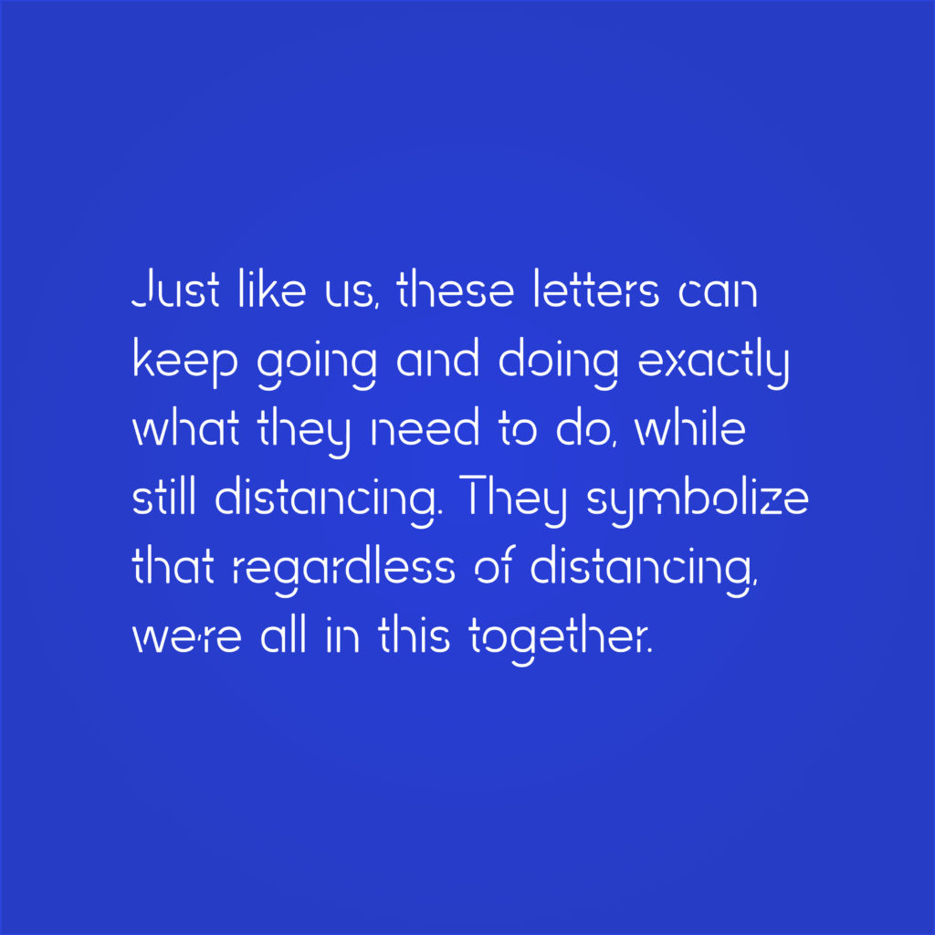
Our Distance Sans typeface, designed for this moment in time, is conceptual yet functional. We’re celebrating the necessary practice of distancing, while also manipulating it to create a tool that can be wielded to connect us further. Just like us, these letters can keep going and doing exactly what they need to do, while still distancing. They symbolize that regardless of distancing, we’re all in this together.