WK Kellogg Foundation Brand Refresh
For the WK Kellogg Foundation brand refresh we aimed to create clarity, consistency and alignment within their organization. Our work with them began with a multiyear rigorous examination, and culminated in a five-part identity guide, and My WKKF Day, a massive staff event to unveil the new brand. (read more)
What we did
- BRAND STRATEGY
- VISUAL IDENTITY
- TAGLINE
- TRAINING DESIGN + EVENT PRODUCTION
- VIDEO
- ART DIRECTION
- PRINT COLLATERAL
- ANNUAL REPORTS
- MICROSITE
- ENVIRONMENTAL GRAPHICS
Founded in 1930, the W.K. Kellogg Foundation (WKKF) is an independent, private foundation and among the largest philanthropic foundations in the United States. Guided by the powerful belief that all children should have an equal opportunity to thrive, WKKF approached us for a brand refresh that would create clarity, consistency and alignment for their organization to strengthen their ability to fulfill their mission.
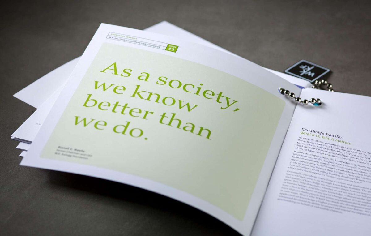
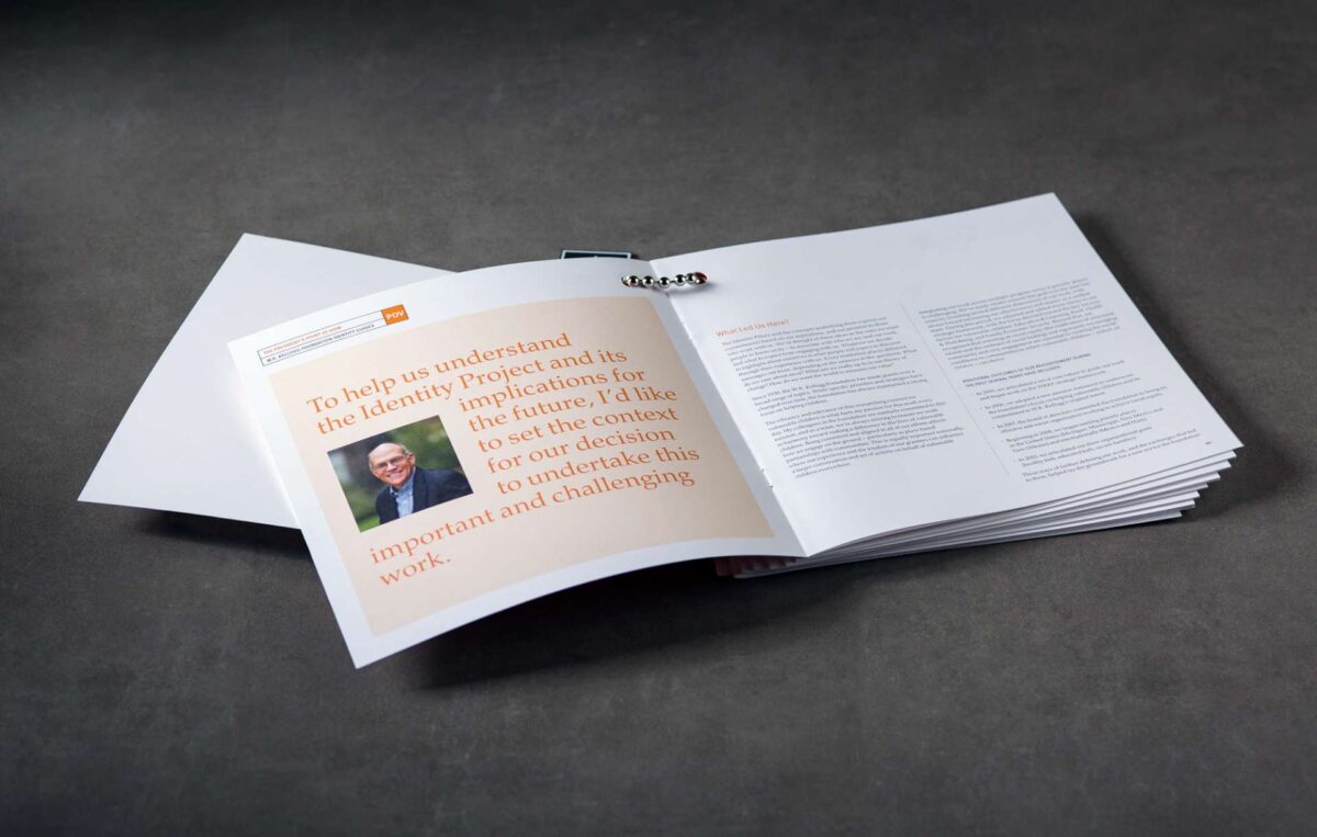
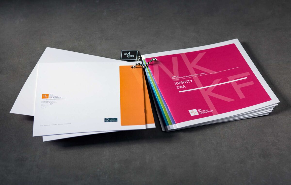
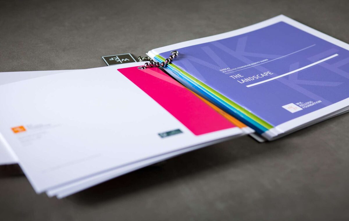
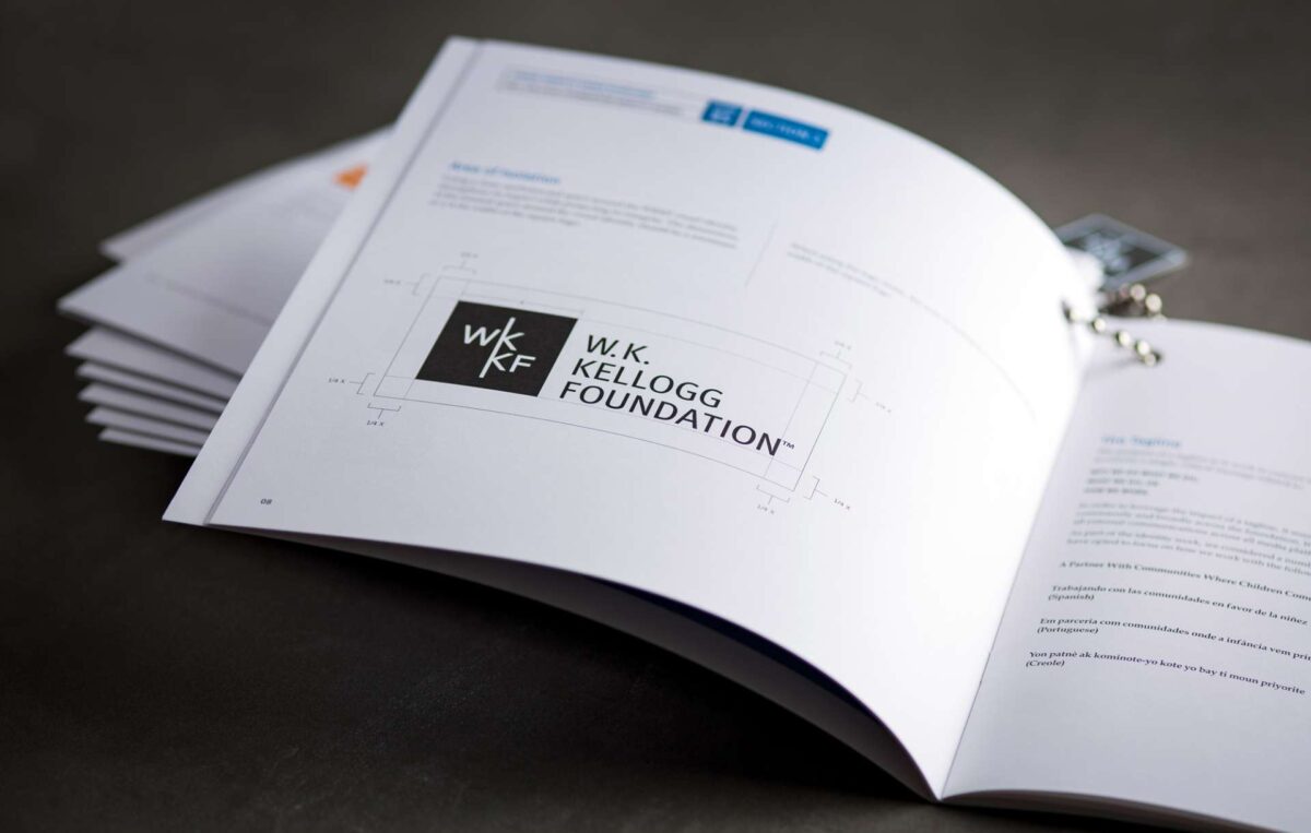
Working with our partners at ROI Ventures, we embarked on a multi-year rigorous examination of their brand. Our work culminated in redesigning the WKKF visual identity and documenting our brand illumination and new messaging platform in a comprehensive, five-part Identity Guide: Identity DNA; The Landscape; Knowledge Transfer: What It Is, Why It Matters; Identity Expression; and Visual Identity Usage Guidelines.
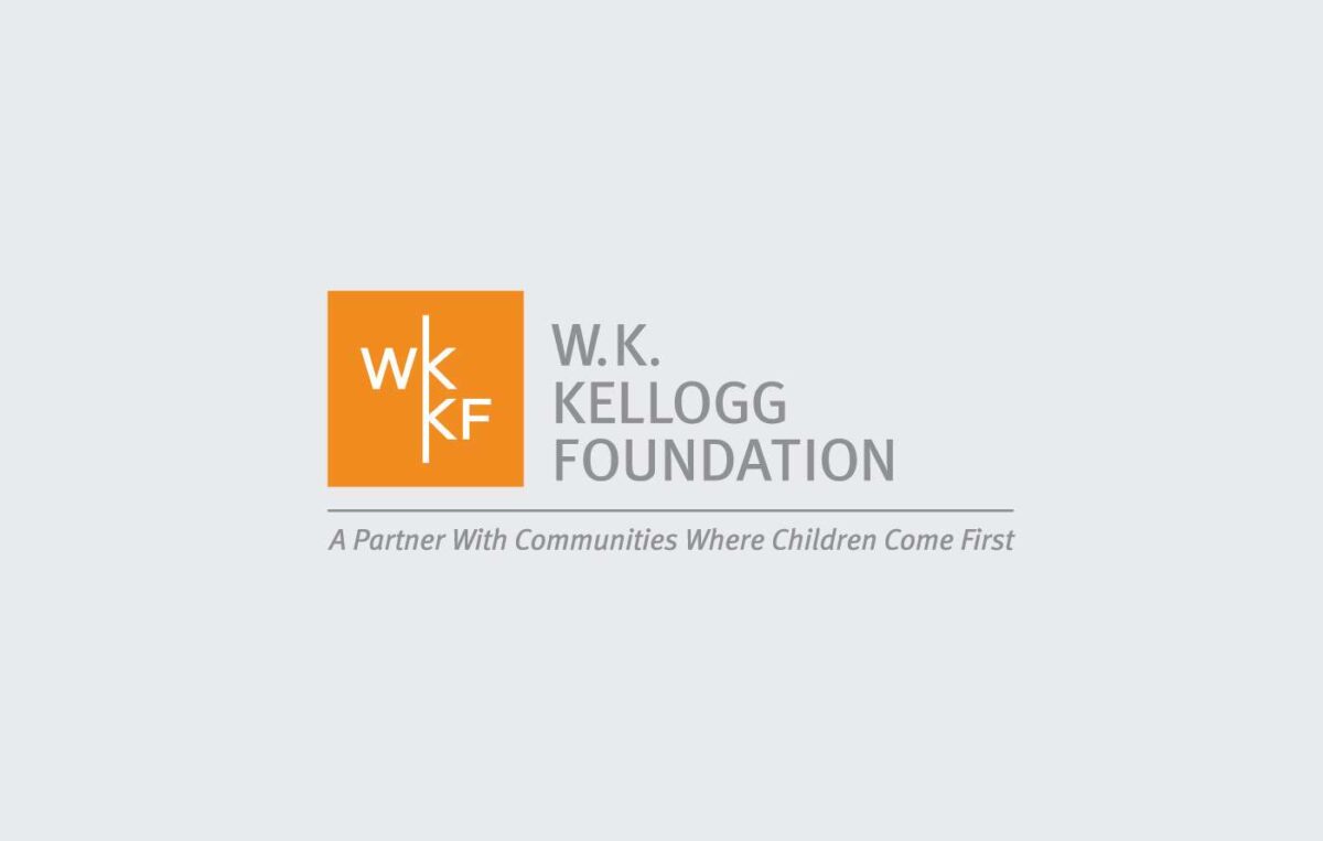
As part of brand messaging, we created the tagline A Partner With Communities Where Children Come First. Clear and powerful, the statement acts as a throughline, touching every aspect of the organization’s mindset and operation.
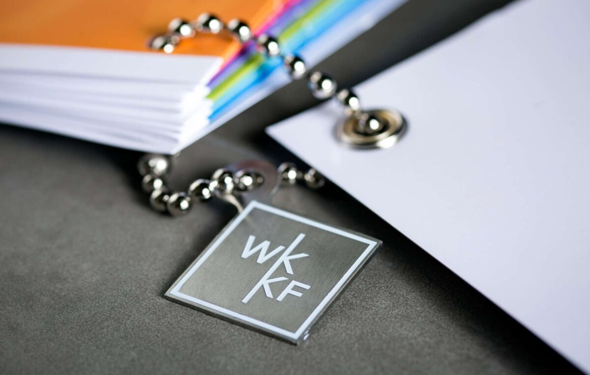
The new visual identity provides crispness and clarity; transforming the name into a designation that acts as its own mark: WKKF. The letterforms in this orange square set the organization inside the communities they serve, with a beautiful combination of upper- and lowercase letters reflective of WKKF operating at eye-level. Beautifully balanced yet rejecting conventional symmetry, we position the organization as sophisticated and confident in creating conditions that are unexpected and effective.
Always the challenge within a large organization — particularly in the philanthropic field — is how can we fully integrate this dramatic brand refresh to see profound change within the organization?
Our response to this challenge: creating My WKKF Day, a massive event for 350+ staff themed Many Stories, One Voice, with a full day of programming, designed to expand the organization’s ways of thinking, seeing and being. Alongside activities that included channeling strategy through board games and practicing elevator speeches through improv, we invited The Moth to teach the art and craft of storytelling.
With WKKFDay dedicated to rolling out the new brand in practice, we also created a video that formally introduced staff to the brand itself. Played to enthusiastic and emotional cheers, the video served as a rallying cry for an organization already bound by a powerful mission, needing only the words and visuals to propel them forward.
What we did
- BRAND STRATEGY
- VISUAL IDENTITY
- TAGLINE
- TRAINING DESIGN + EVENT PRODUCTION
- VIDEO
- ART DIRECTION
- PRINT COLLATERAL
- ANNUAL REPORTS
- MICROSITE
- ENVIRONMENTAL GRAPHICS


