


Forth™
On January 9, 2023, the Debt Pay companies introduced Forth™ — their new brand that represents the coming together of Debt Pay Gateway and DebtPayPro. (read more)
What we did
- Brand Strategy
- Naming
- Visual Identity
- Website
- Transition Execution
- Marketing Collateral


Since their founding in 2009, Forth has served debt relief service providers and consumers with robust solutions that include CRM, marketing automation, payment processing and dedicated account management offerings. With a focus on security, compliance and reliability, they have fostered close relationships in the debt relief space that inspired them to find new and better ways to serve the industry. Uniting the two companies allows them to pool their considerable resources to continue to serve the debt relief industry with the highest possible level of service, along with the most robust set of products and services.
Using our empathic approach to brand strategy as a roadmap, our naming process was robust and expansive, and drew us to the name Forth. Forth is a declaration and an invitation. A starting point. It captures a moment in time when the past and the present turn towards the future and all the possibility it holds. Forth has the confidence to co-opt a common adverb and elevate its simplicity and matter-of-factness to express the essence of the brand as aspirational and optimistic.epresent the vision, culture and mindset of the combined companies.
Coupled with the new tagline, Paving the way for financial wellness, we set out to design the visual identity, where the mark represents a kind of passage or gateway to stability, possibility and peace of mind. The symbol is also a trompe l’oeil, since it makes a flat object appear to be three-dimensional; this adds energy and serves as a provocative focal point for attention.
And finally, the right side of the mark is also an arrow, leading the way to change, progress, possibility. The symbol pairs beautifully with the friendly sans serif, lower-case logotype as it appears to float about the letter forms.
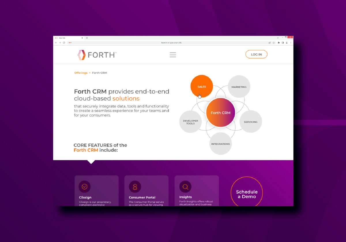
Otherwise has led the charge in crafting and executing a holistic, integrated rebranding plan. From a new website to collateral materials and customer communication, we are supporting the smooth transition to a unified brand.

What we did
- Brand Strategy
- Naming
- Visual Identity
- Website
- Transition Execution
- Marketing Collateral