


Chicago Humanities Festival
Through our rebrand for Chicago Humanities Festival, we encouraged a more profound connection to programs, audience and impact, coining their audience as “cultural explorers” and establishing a logo utilizing a “path” as a metaphor for discovery. (read more)
What we did
- BRAND STRATEGY
- TAGLINE
- VISUAL IDENTITY
- PRINT COLLATERAL
- MERCHANDISING

A pioneer in humanities programming in Chicago that began in 1990, the Chicago Humanities Festival reached out to Otherwise on the cusp of their 27th anniversary, seeking a way to move beyond a newly-adopted strategic plan to establish a more profound connection to programs, audience and impact.
Through our process of using empathic inquiry to tap into the heart and soul of a brand, we discovered that what distinguishes CHF patrons, supporters and staff is their love of exploration as a way to better understand the world around them and to recalibrate their own existing perceptions. From this insight, we coined the term “cultural explorers” to define the audience of CHF.
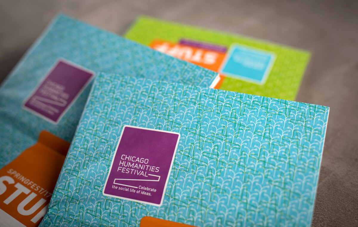
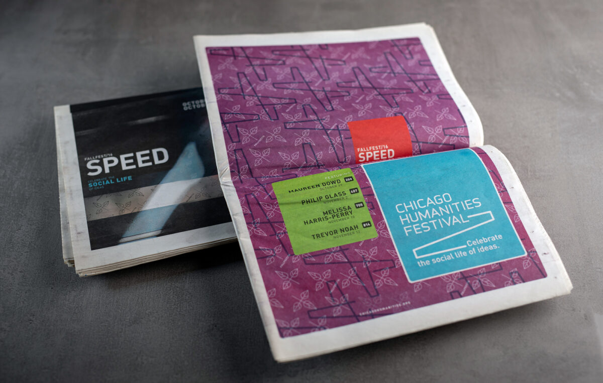
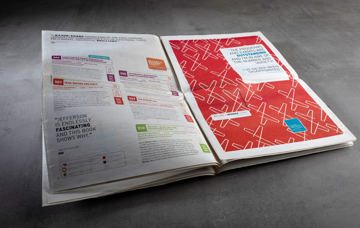
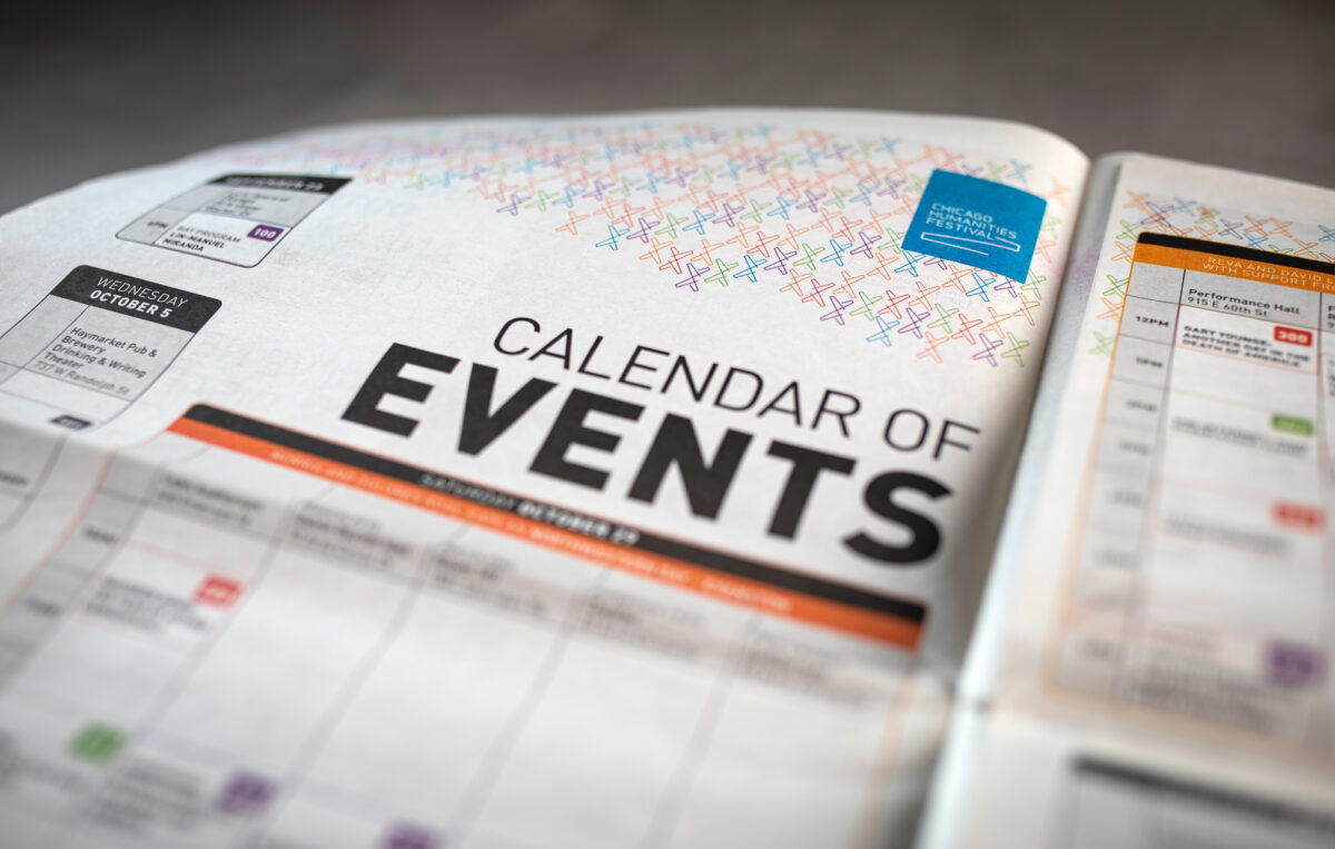
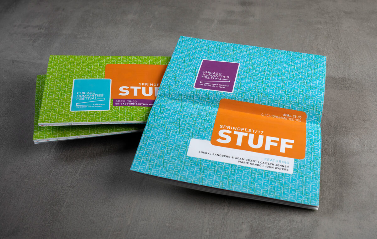
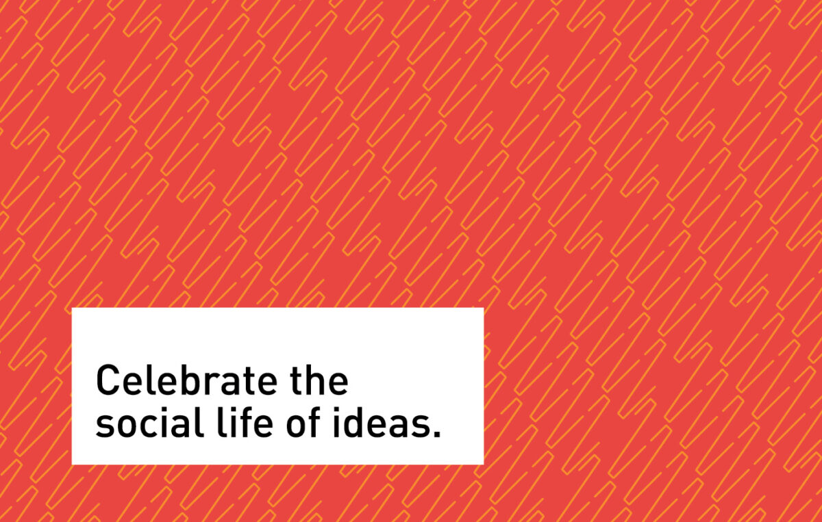
With audience in mind, we created robust new brand messaging for CHF. Centered around the shared belief that “Humanity happens when people gather, share ideas, are inspired by others and abandon themselves to ideas that are beyond their individual experience,” we deployed our own tools of creative exploration to design the visual identity.
Capitalizing on the spirit of the cultural explorer and the transformative quality of taking a journey, we introduced the vernacular of a “path” as a metaphor for discovery in the logo. The path is open-ended, without specific destination — creating an intuitive and pleasing visual metaphor to adapt across CHF’s programming.
What we did
- BRAND STRATEGY
- TAGLINE
- VISUAL IDENTITY
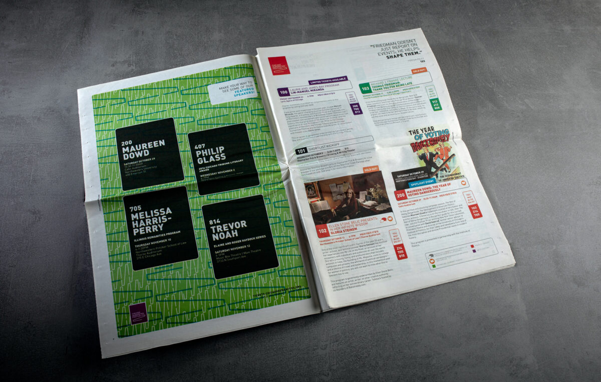
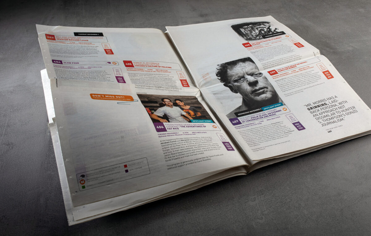
- PRINT COLLATERAL
- MERCHANDISING