Sentosa
Representing upscale residential communities in suburban markets across Florida, Sentosa developments are places to live your best life. We developed a rich brand for Sentosa, guided by its vision to set a unique standard for luxury apartment living. (read more)
What we did
- Brand Positioning
- Visual Identity System
- Tagline
- Collateral
With an eye towards emerging housing trends that respond to the next generation of millennial
and workforce migration, the Sentosa brand reflects a new sensibility, where the rush to the urban core is replaced by the desire for the best of city living within lower density, well-located, affluent neighborhoods/submarkets.
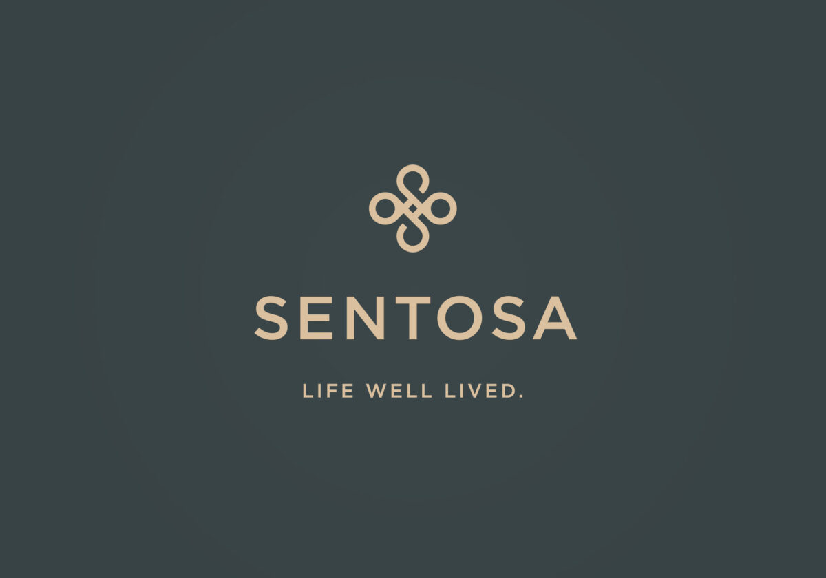
In thinking about the Sentosa visual identity, we were drawn to the meaning of the Sanskrit word santosha — which embodies the attributes of tranquility, satisfaction and contentment — as our inspiration.
The logo itself is an expression of both harmony and openness, with symmetry that conveys balance and stability. Its circles and curves coalesce at the center as a metaphor for placemaking, while these references to the coexistence of opposites speak directly to the very
essence of “santosha.”
The wordmark takes advantage of the power of the Gotham typeface — introduced in 2000. Gotham is that rarest of designs that feels somehow familiar with its honest tone that is assertive but never imposing, friendly but never folksy, confident but never aloof.
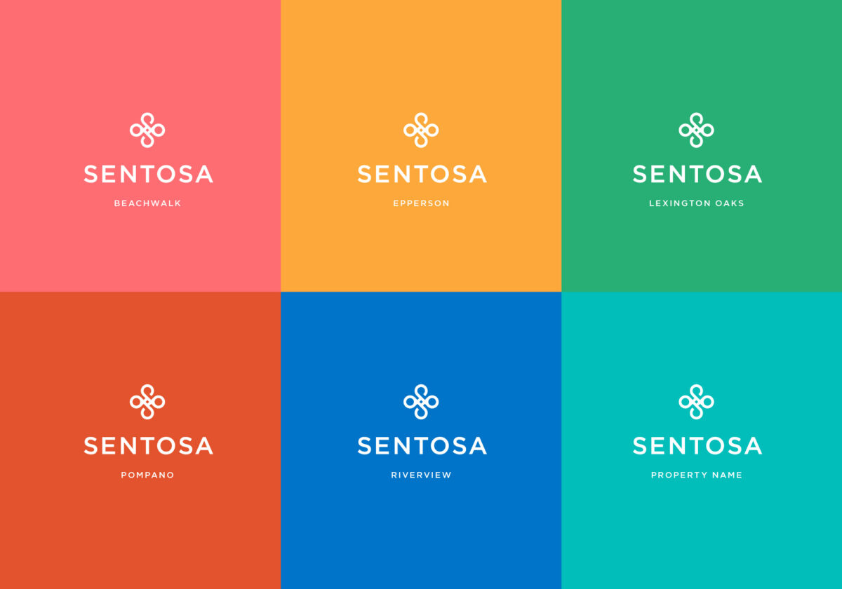
The tagline Life well lived. is crisp, direct and simple, and conveys a promise about the brand that is hard to resist. We also developed a system of subbrands that are designated for each of the individual properties. Each subbrand is represented by its own distinct color, and the tagline is replaced by the name of the property.
What we did
- Brand Positioning
- Visual Identity System
- Tagline
- Collateral


