


Renelle on the River
For Belgravia Group’s riverfront real estate project, we chose the name Renelle, inspired by the word runnel (a delicate stream or brook) and the word renaissance, to reflect the tantalizing promise of a new beginning for both the site and the building’s residents. (read more)
What we did
- BRAND STRATEGY
- NAME
- VISUAL IDENTITY
- WEBSITE
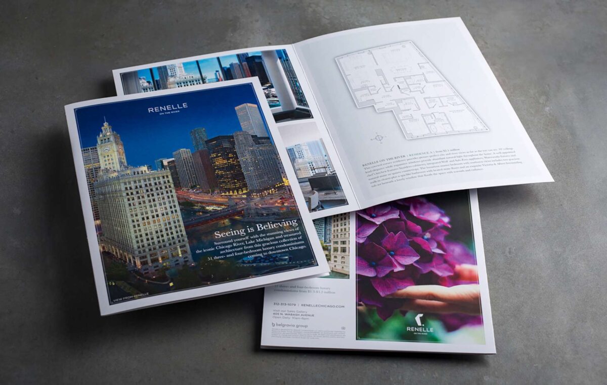
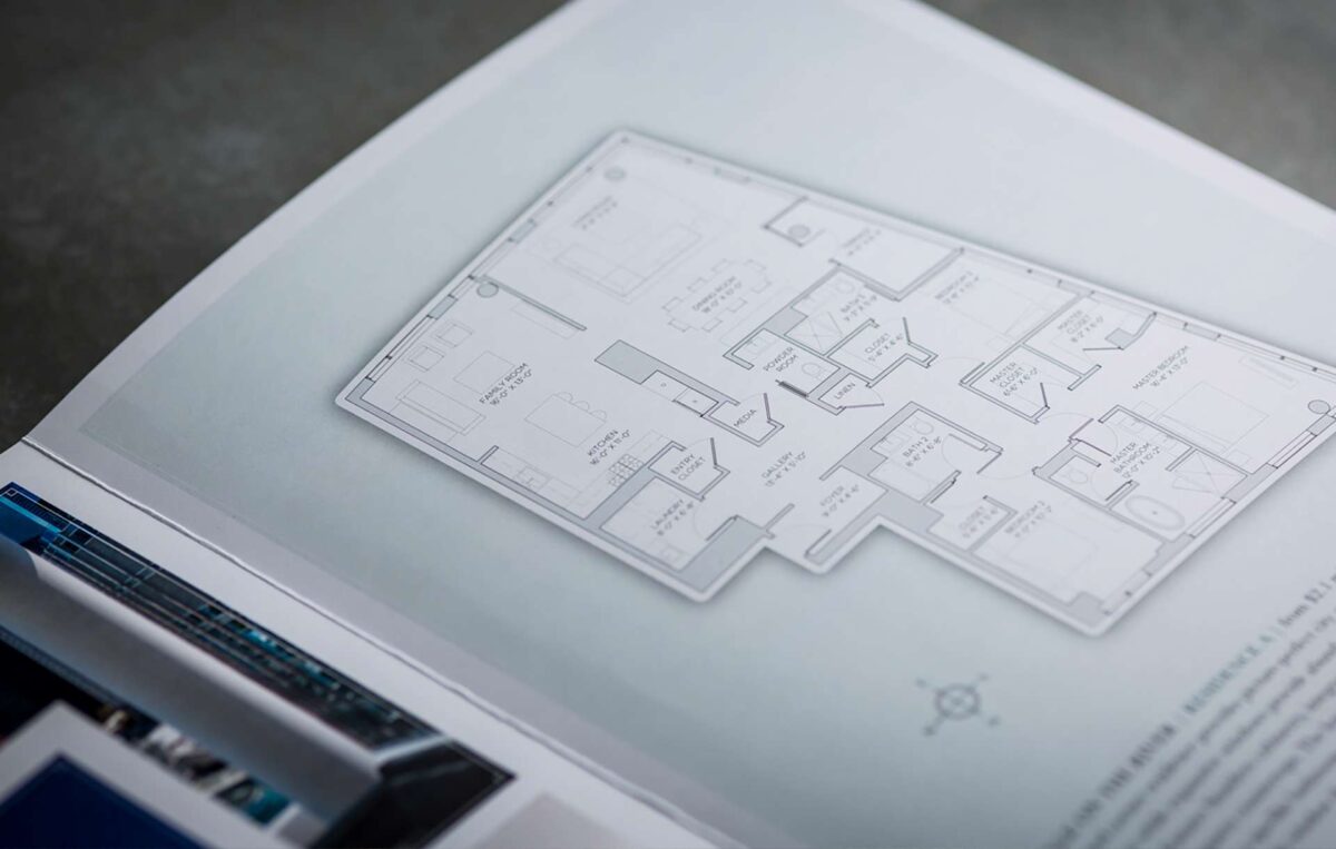
- PRINT COLLATERAL
- PRINT ADVERTISING
- DIGITAL ADVERTISING
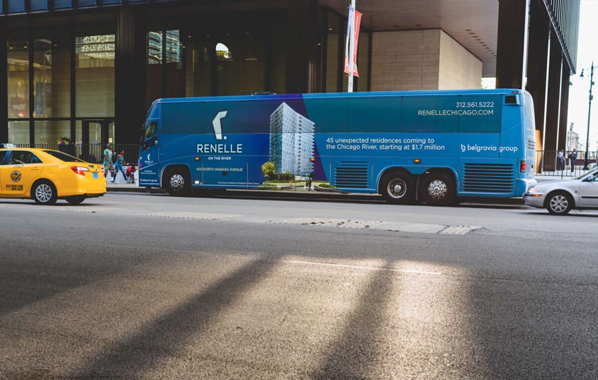
- OUT OF HOME ADVERTISING
- CONSTRUCTION BARRICADE
- SALES GALLERY GRAPHICS
- DIRECT MAIL CAMPAIGN
Dedicated to providing the highest quality homes and real estate services to their clients, Belgravia Group approached Otherwise to conceive a brand for their ambitious luxury residential real estate project on the Chicago River. The project was destined to become a desired option for sophisticated urban living that leverages ultra-refined architecture, riverfront location and refined amenities to speak directly to a discerning audience of homebuyers.
Inspired by the building’s sophistication and nuance, we built a brand that positions it as an unexpected, one-of-a-kind opportunity for those who are “in the know,” refined connoisseurs who seek the best in urban life. Created around the concept of being “hidden in plain sight,” we developed a platform that allows the building to stand out in the Chicago real estate market.
Inspired by the word runnel — a delicate stream or brook — we chose the name Renelle for the building, since it carries the fluidity and refined gesture of the building’s architecture while referencing the sights and sounds of the Chicago River. Renelle is also a derivation of renaissance, reflecting the premise of a new beginning for both the site and the building’s residents.
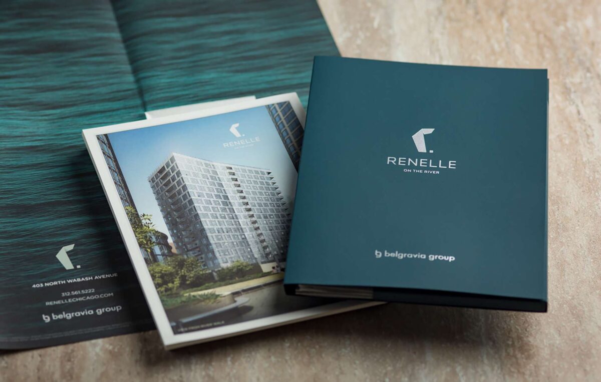
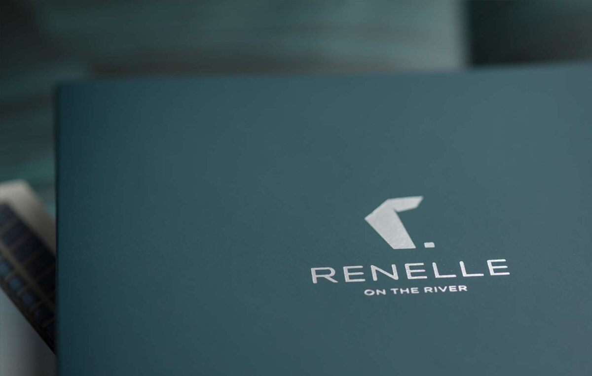
With the positioning, name and tagline in place, we developed a host of creative assets for Renelle, beginning with its visual identity. Drawing inspiration from the building’s architecture, we developed a stylized “R” with folds that mimic the building’s shape — an elegant representation that reflects the building’s refinement and subtlety.
What we did
- BRAND STRATEGY
- NAME
- VISUAL IDENTITY
- WEBSITE
- PRINT COLLATERAL
- PRINT ADVERTISING
- DIGITAL ADVERTISING
- OUT OF HOME ADVERTISING
- CONSTRUCTION BARRICADE
- SALES GALLERY GRAPHICS
- DIRECT MAIL CAMPAIGN