


CASEL
With CASEL’s aim to nourish and foster the growth of children, we created a visual identity to exude that same sensibility; to function as a dynamic system where flexible arrangements suggest new solutions and meanings. (read more)
What we did
- CREATIVE STRATEGY
- VISUAL IDENTITY
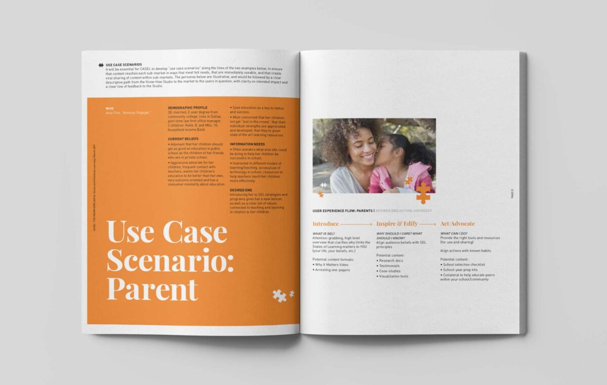
- PRINT COLLATERAL
- VISUAL IDENTITY GUIDELINES
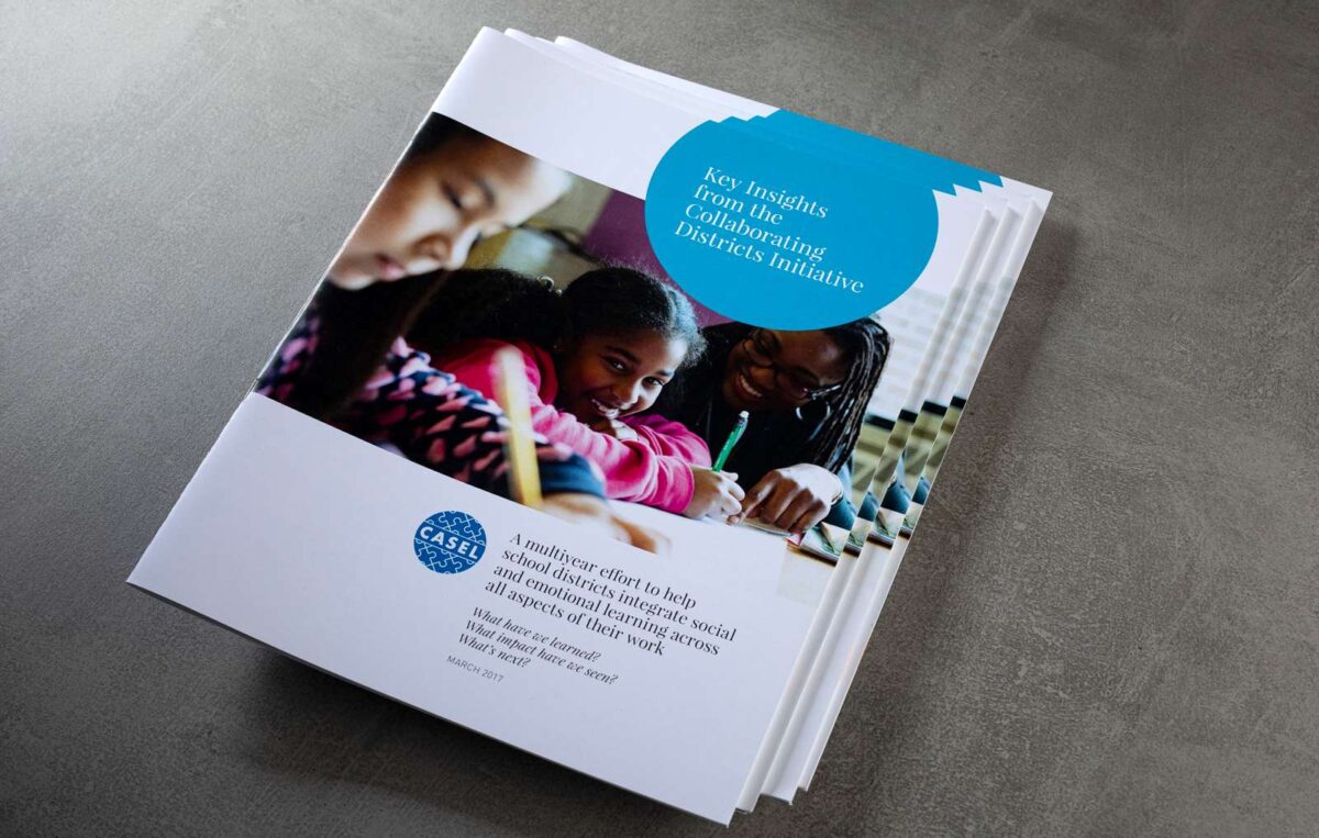
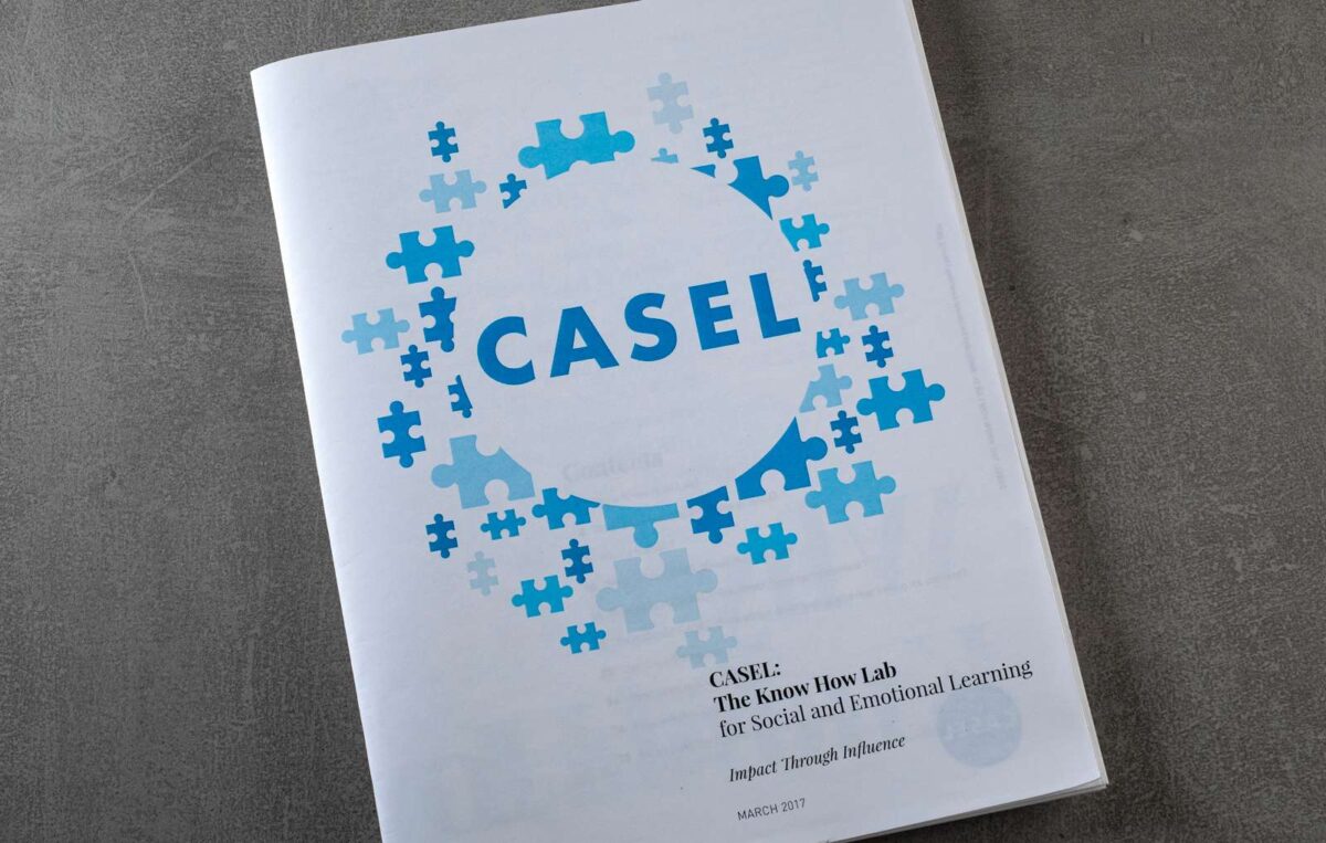
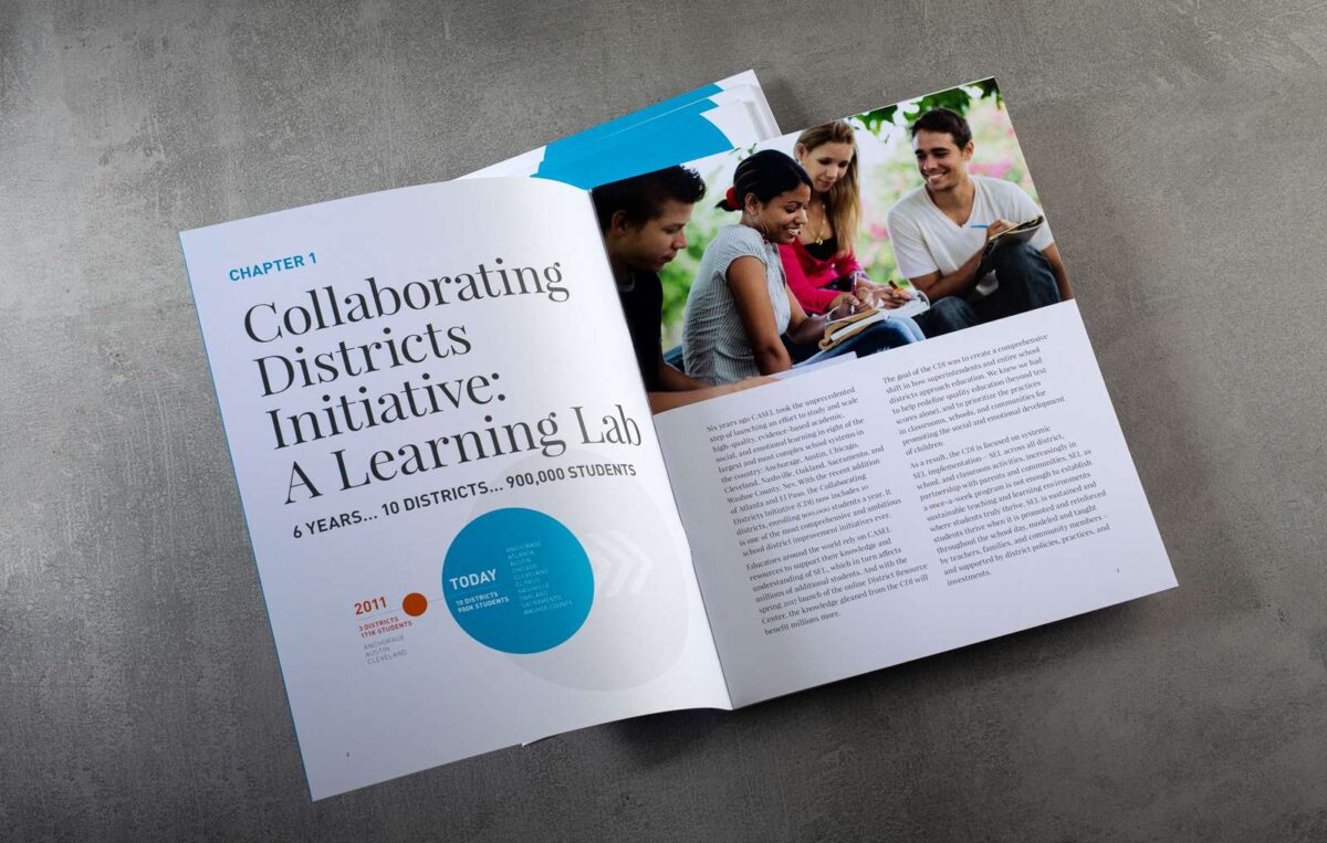
Social and emotional learning (SEL) is a process through which children and adults acquire and effectively apply the knowledge, attitudes and skills necessary to understand and manage emotions. As the leading national organization dedicated to advancing this science-based practice, CASEL has been vetting SEL research for over twenty years. They came to us at a turning point, to build a new identity that would illuminate and amplify their focus.
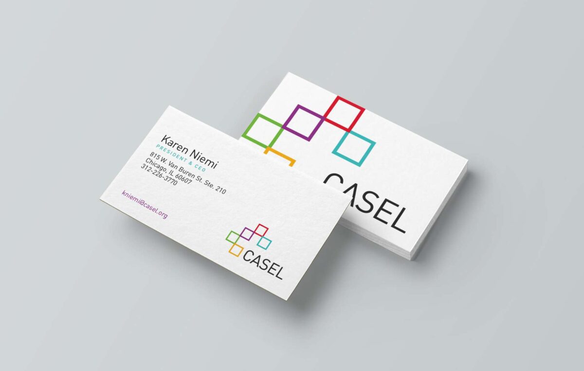
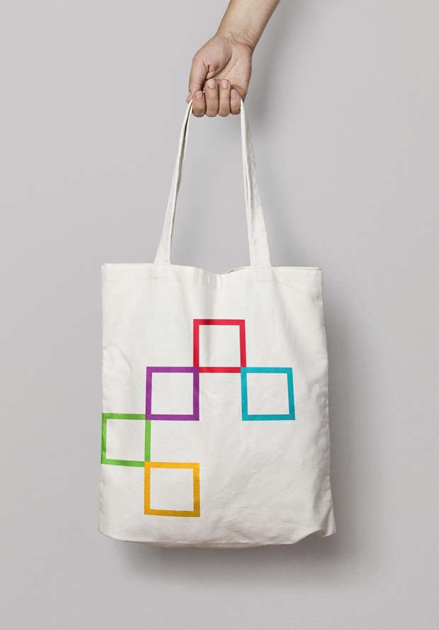
We approached the design of the new visual identity with the future of the organization in mind, which led us to a mark comprised of a set of five colorful boxes overarching the logotype, representing a flexible path that suggests CASEL’s chief aim, to nourish and foster the growth of children to be knowledgeable, responsible, caring and contributing individuals. The identity functions as a dynamic system, as well, where the arrangement of boxes can shift and mutate to suggest new solutions and meanings. It harkens to CASEL’s chief aim, to nourish and foster the growth of children to be knowledgeable, responsible, caring and contributing individuals.
What we did
- CREATIVE STRATEGY
- VISUAL IDENTITY
- PRINT COLLATERAL
- VISUAL IDENTITY GUIDELINES