


The Forge
We named this novel adventure park The Forge, as a testament to a space that helps us develop, or forge, new challenges for ourselves within like-minded community. This language set the stage for the meaning embedded in a pared-down, geometric logo. (read more)
What we did
- BRAND STRATEGY
- NAMING
- VISUAL IDENTITY
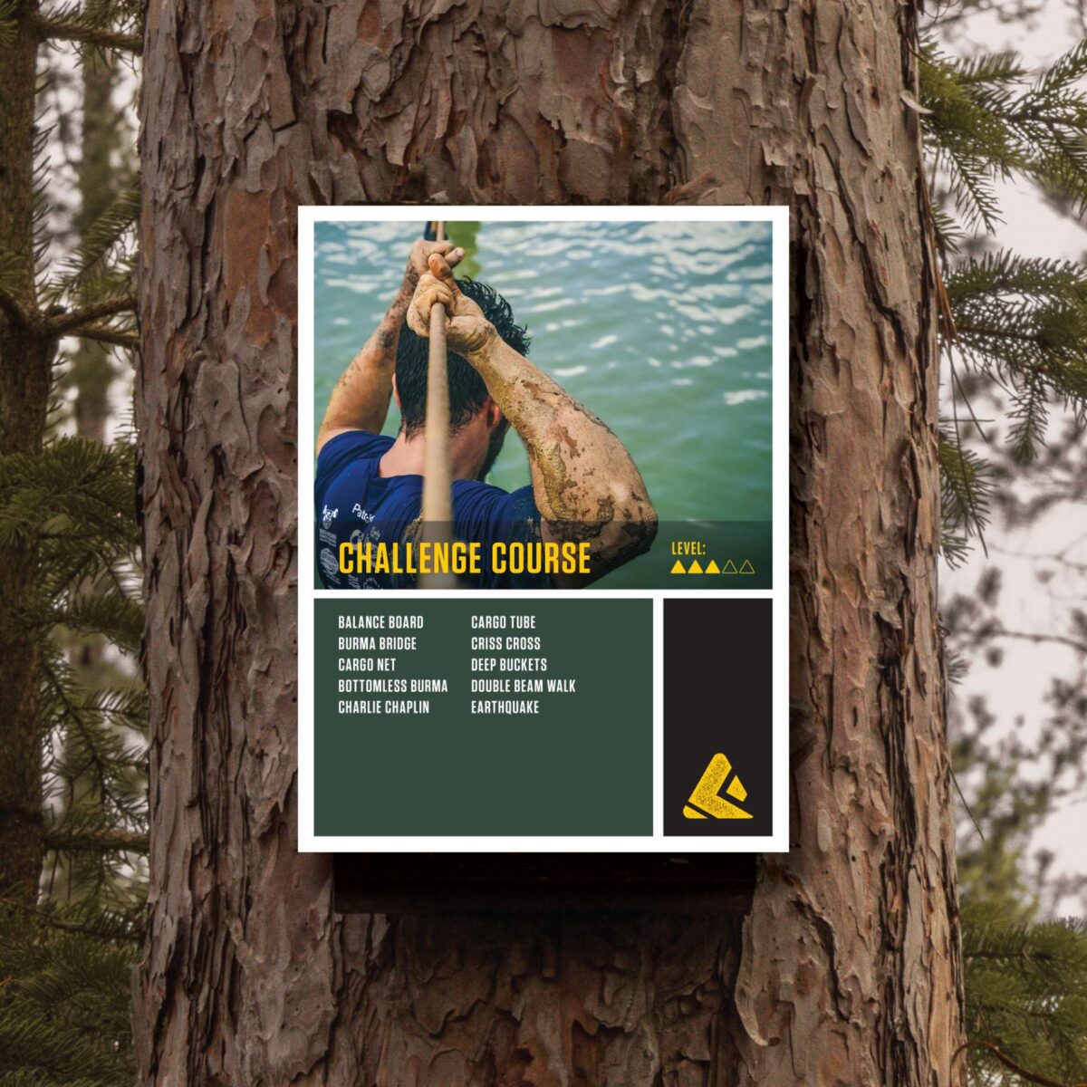
The brainchild of three successful technology entrepreneurs, The Forge is unique to the U.S. market — a novel outdoor experience, based upon a model of public/private social enterprise, that celebrates natural beauty and provides engaging recreational activities for adventurers of all ages and abilities.
Off the bat, we discovered the brand’s core principles and beliefs, and laid the groundwork for messaging and visual assets to follow. As part of the initial content strategy, we named this experience The Forge. Inspired by the thrill of adventure racing, a love and commitment to natural beauty and preservation and an unyielding respect that the definition of physical challenge is highly personal, the name acts as a testament to a space that helps us develop, or forge, new challenges for ourselves within like-minded community.
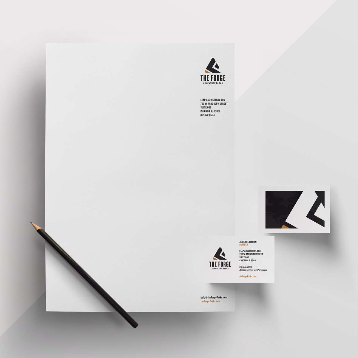
With language setting the stage, we then tackled the visual identity. We designed a logo that is simple and geometric, yet bold and deeply rooted in meaning. The pattern suggests the tread of a boot “forging” ahead, while the triangular shape speaks to a mountain waiting to be tackled. Paired with a color palette of natural hues in blue, green and brown, the full effect is celebratory of what the human spirit can accomplish in the outdoors, and when the public and private sectors come together to share resources and support community.
What we did
- BRAND STRATEGY
- NAMING
- VISUAL IDENTITY